P R O J E C T
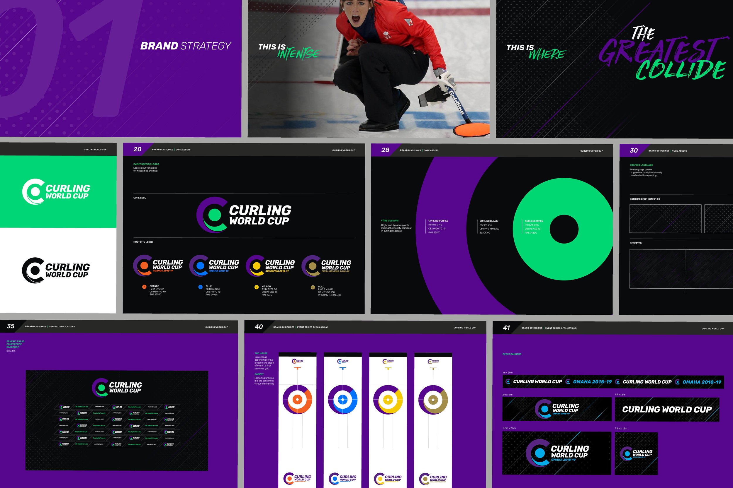
→ Brand Identity
→ Guidelines
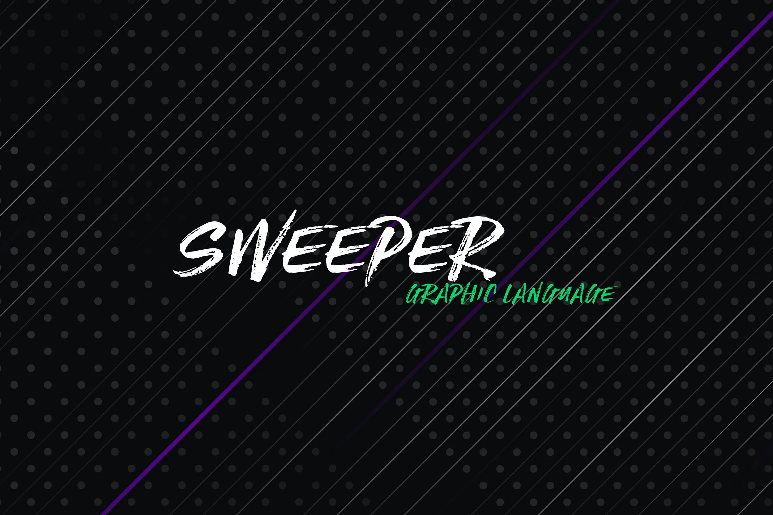
→ Event Graphics
→ Broadcast Toolkit
→ Animated Ident
→ Created at Designwerk
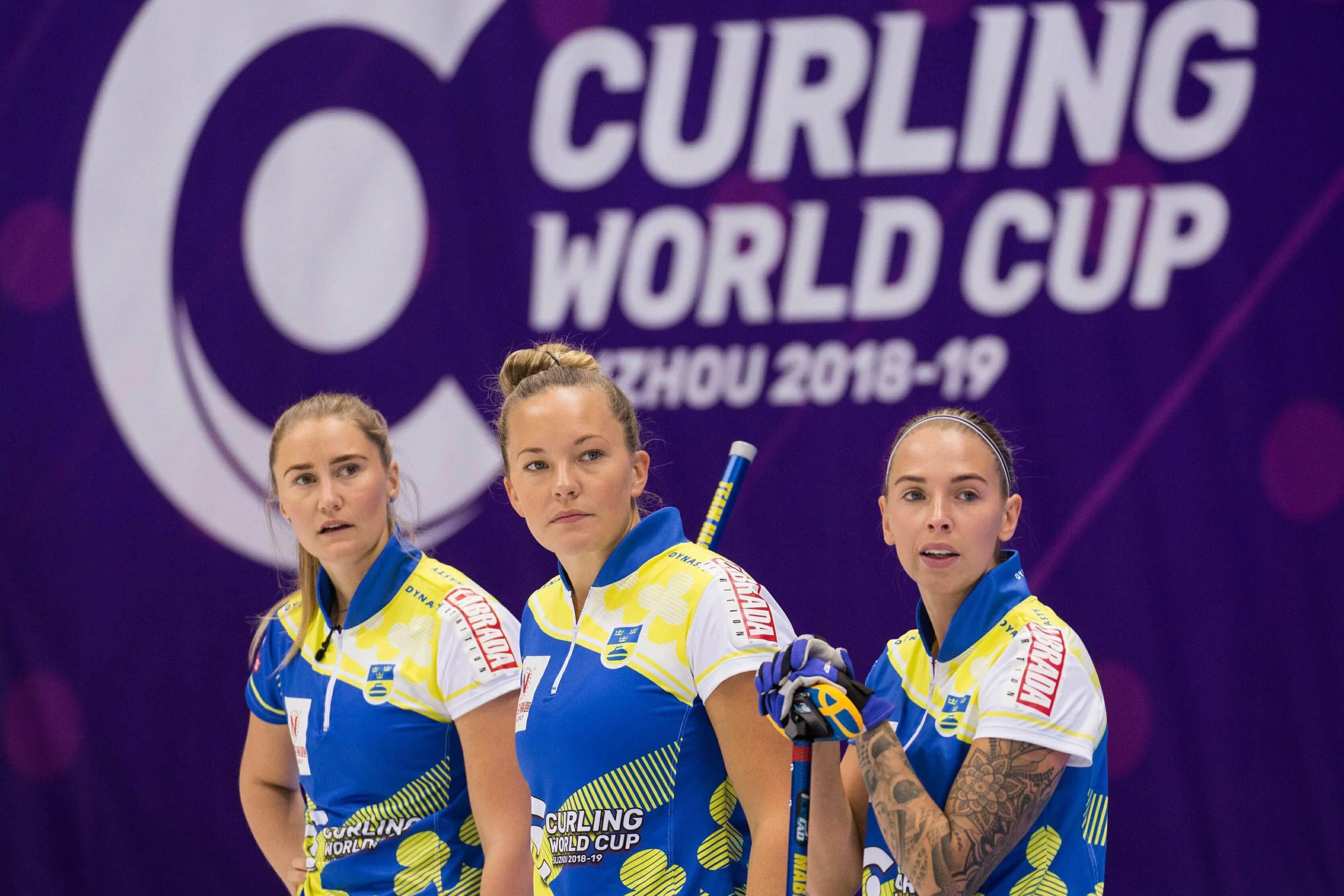
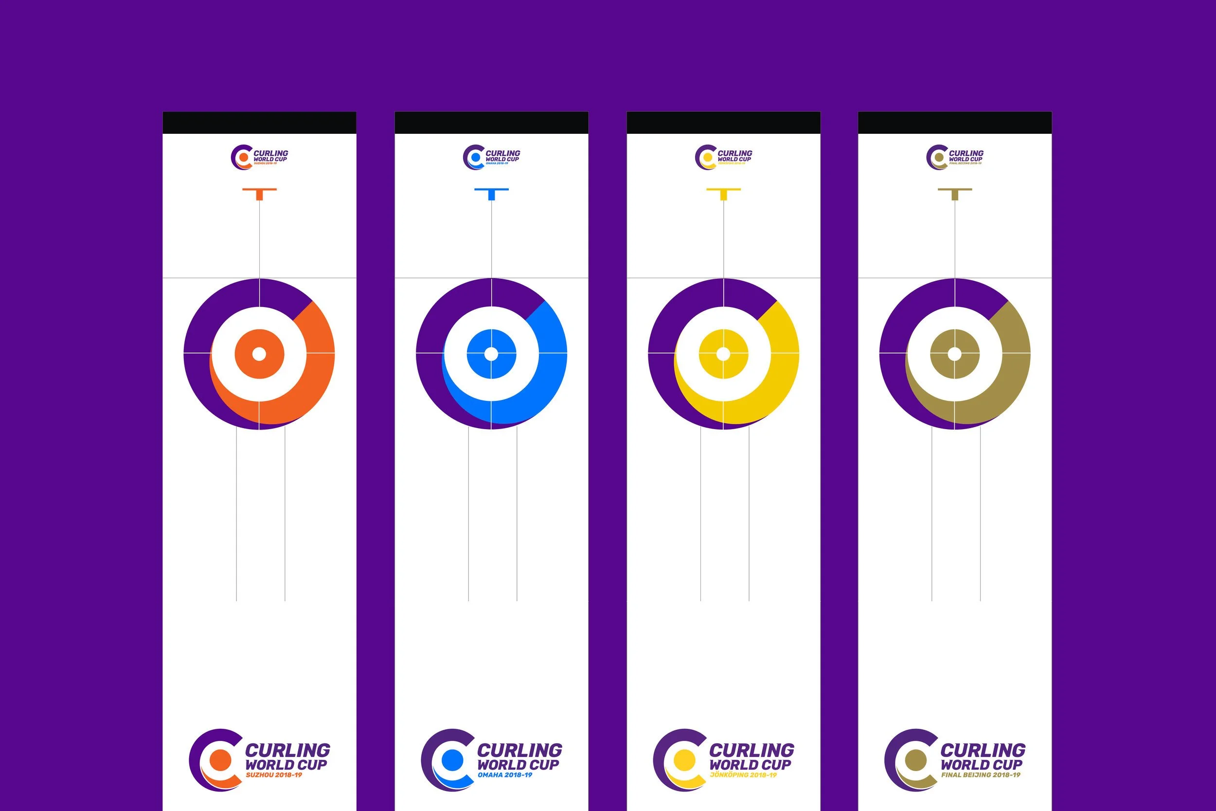
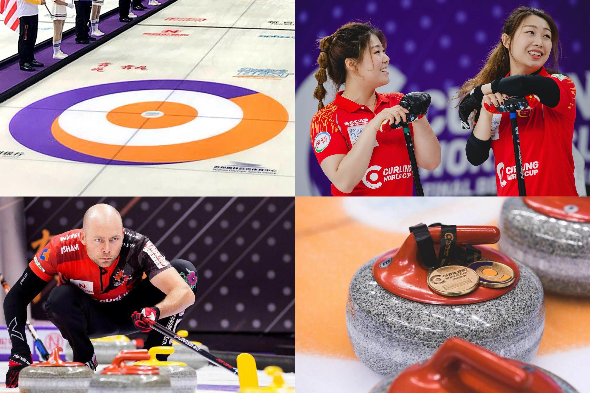
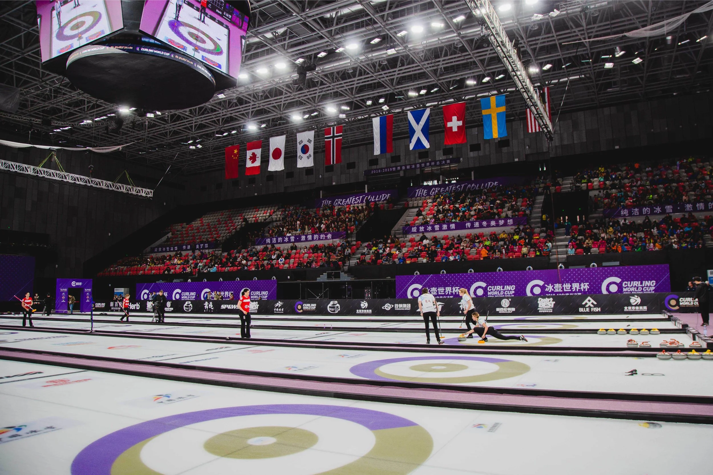
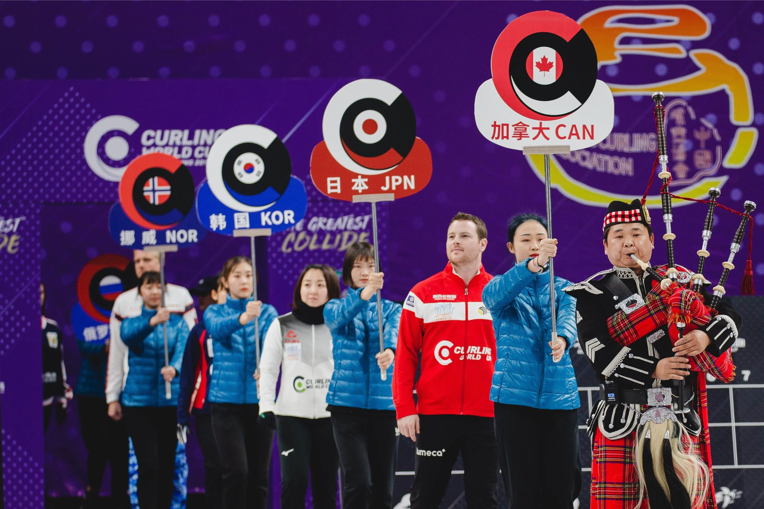
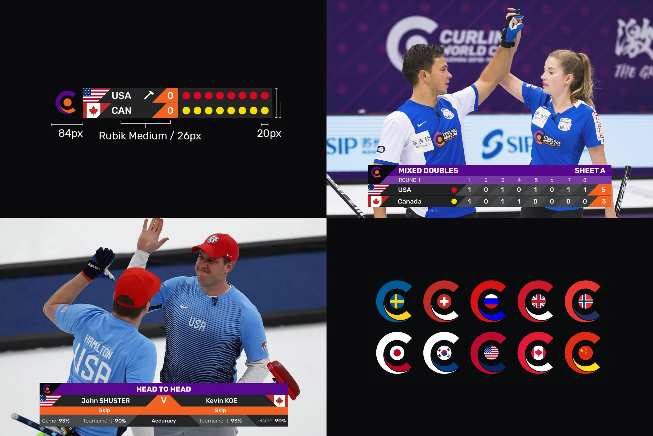
Curling World Cup
T H E C H A L L E N G E
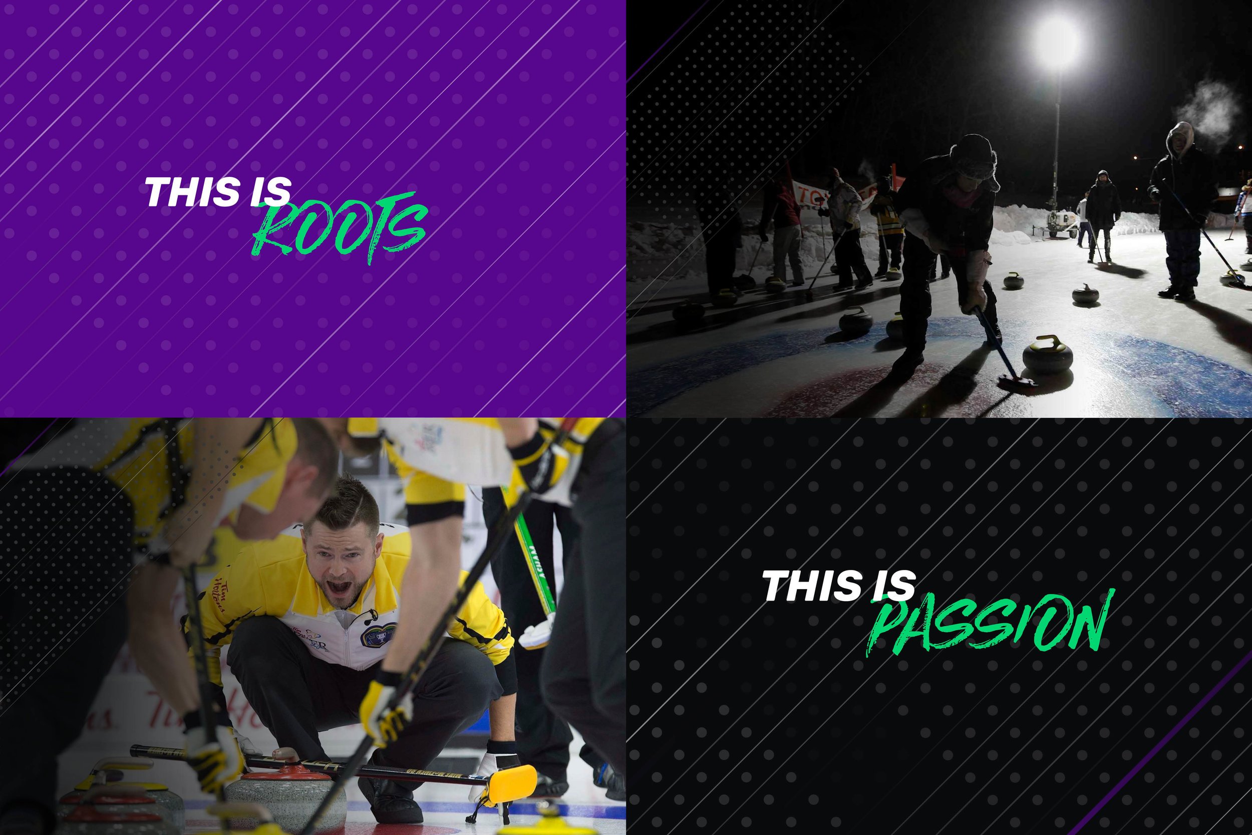
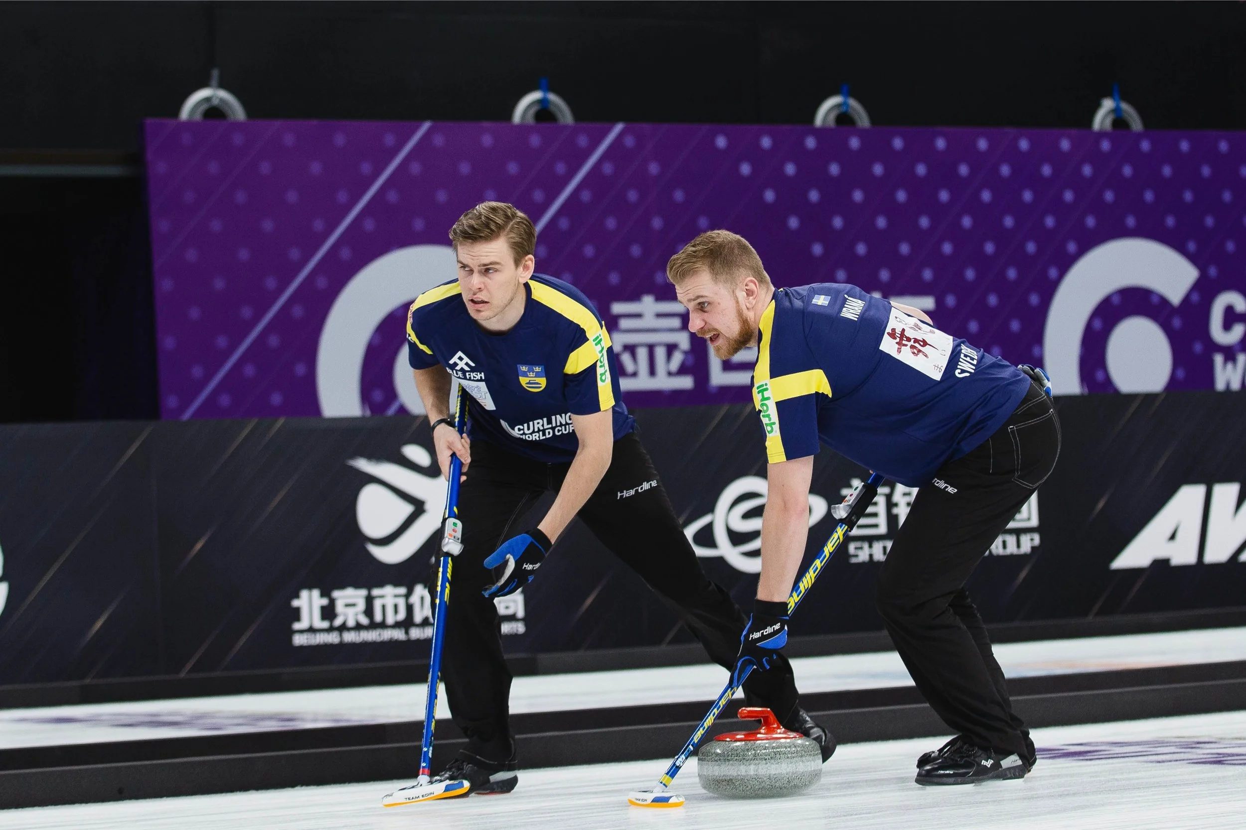
The world’s top Curling competition needed a dynamic, progressive and youthful new brand to bring a new audience to the sport
T H E S O L U T I O N
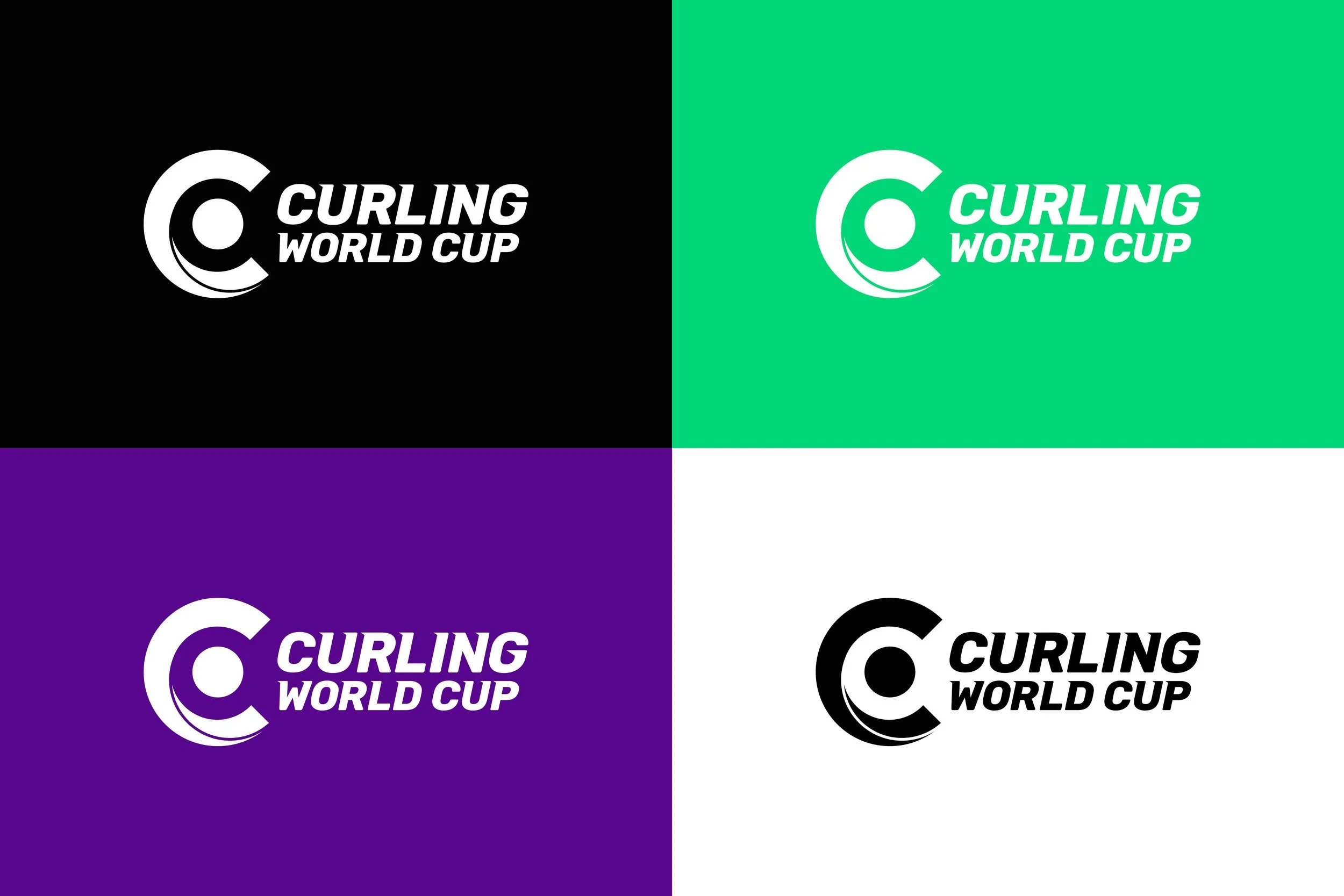
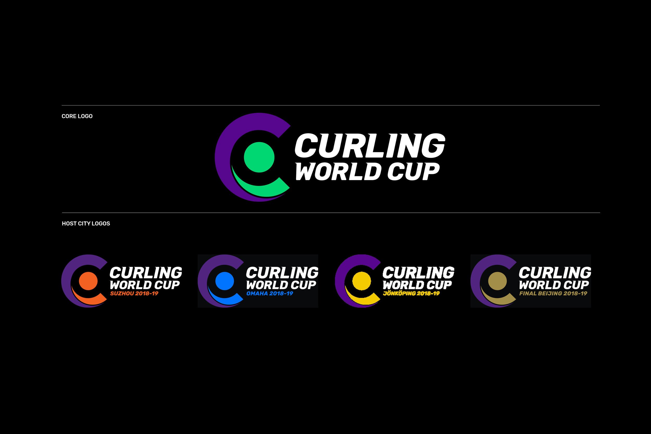
Breaking from trends in the space, the competition was given a bold and vibrant new colour palette, dynamic graphic language based on the motion of the sport, and a ‘C’ symbol that could act as the brand identifier, as well as the on ice marking of the ‘house’ - giving instant brand recognition during television coverage.