Inter Earth
P R O J E C T
→ Brand Identity
→ Website
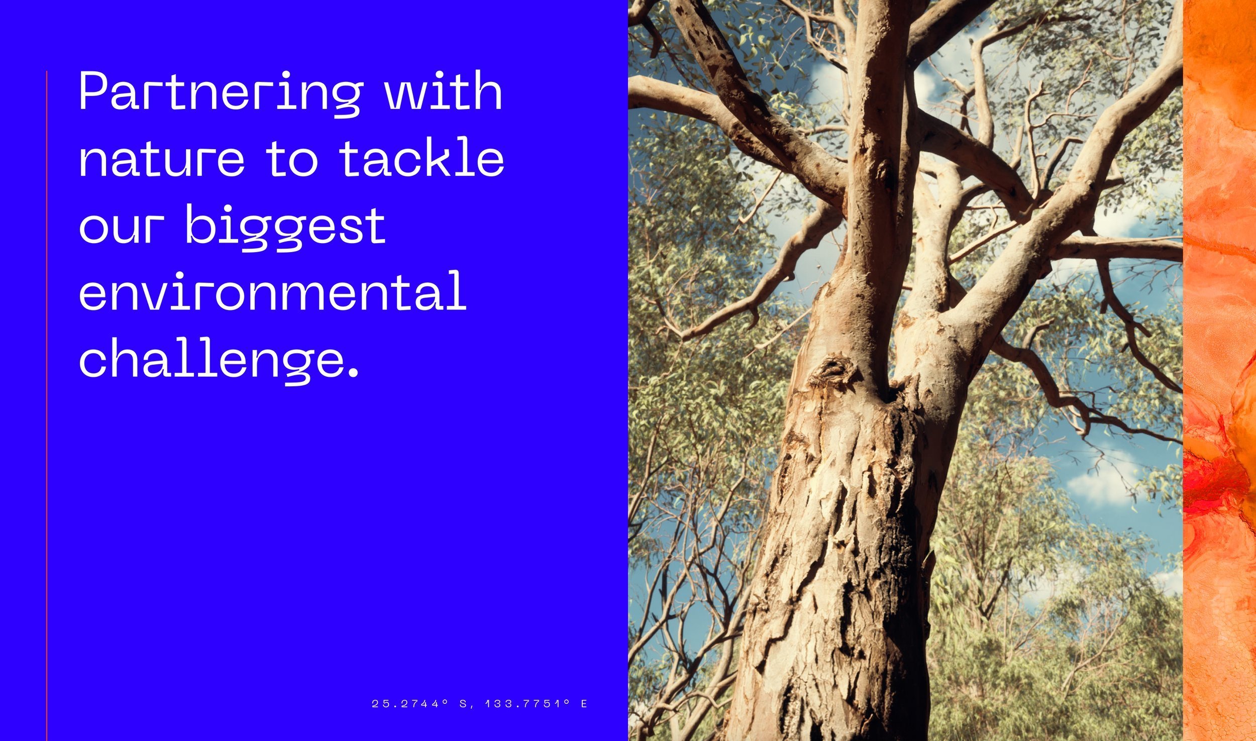
InterEarth have created a pioneering approach to removing excess atmospheric CO2, through a process of growing trees, harvesting the above ground biomass, and burying its contained carbon back underground. They needed a brand identity to reflect their unique proposition
T H E C H A L L E N G E
T H E S O L U T I O N
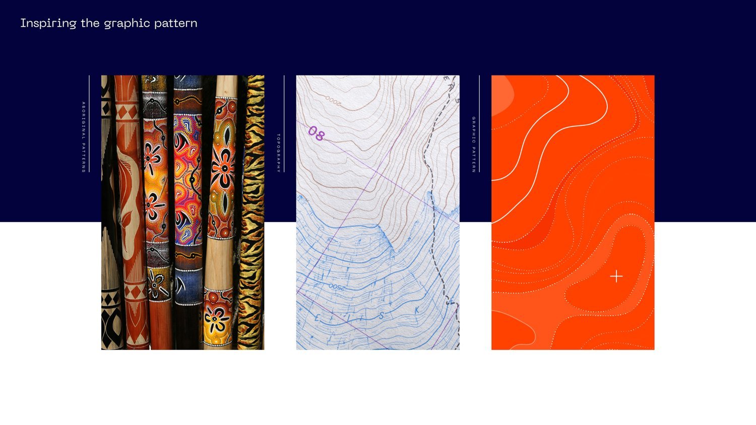
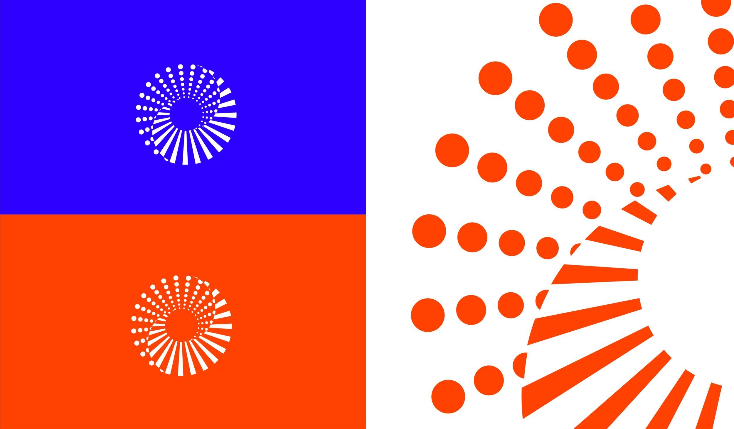
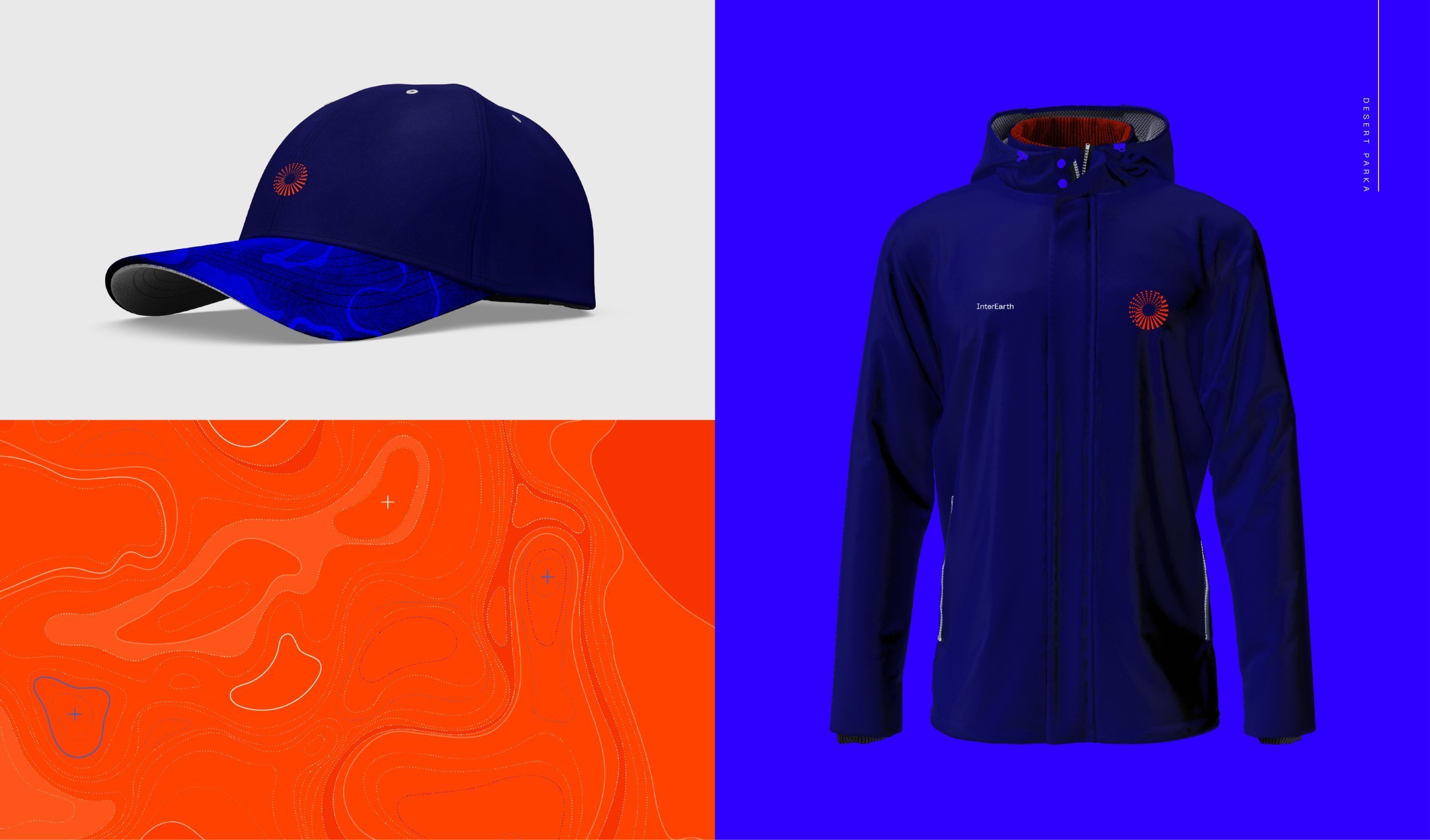
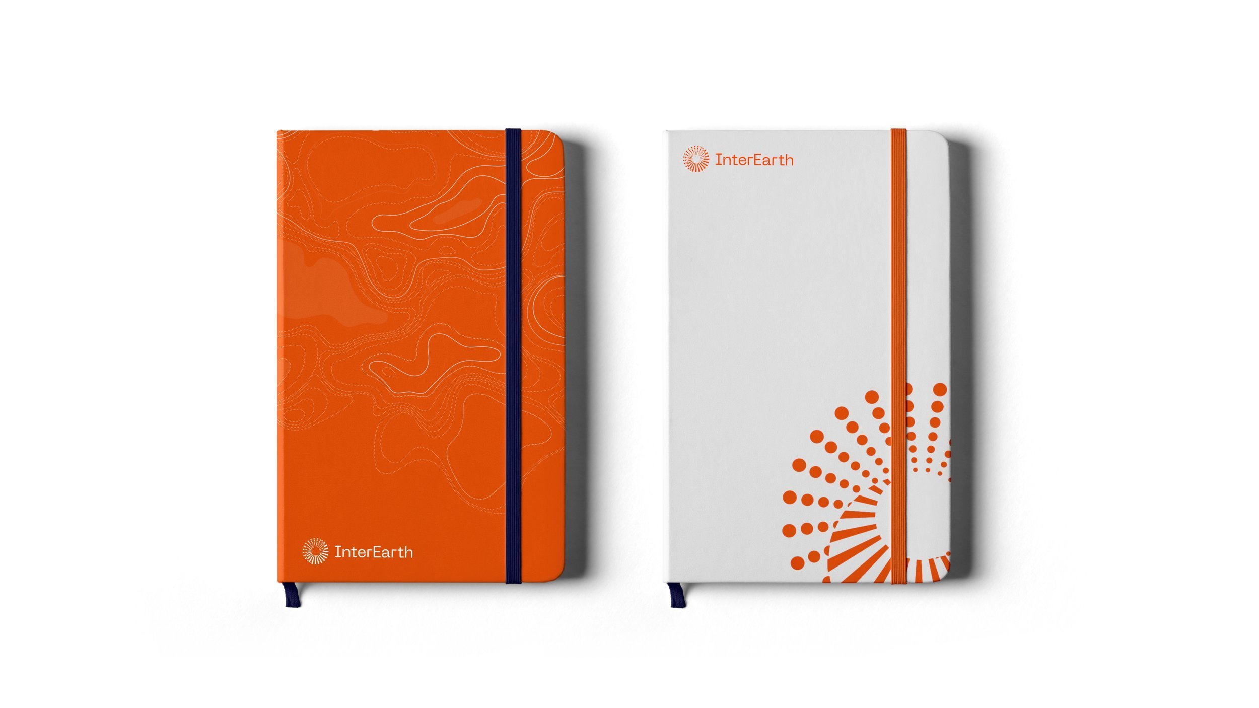
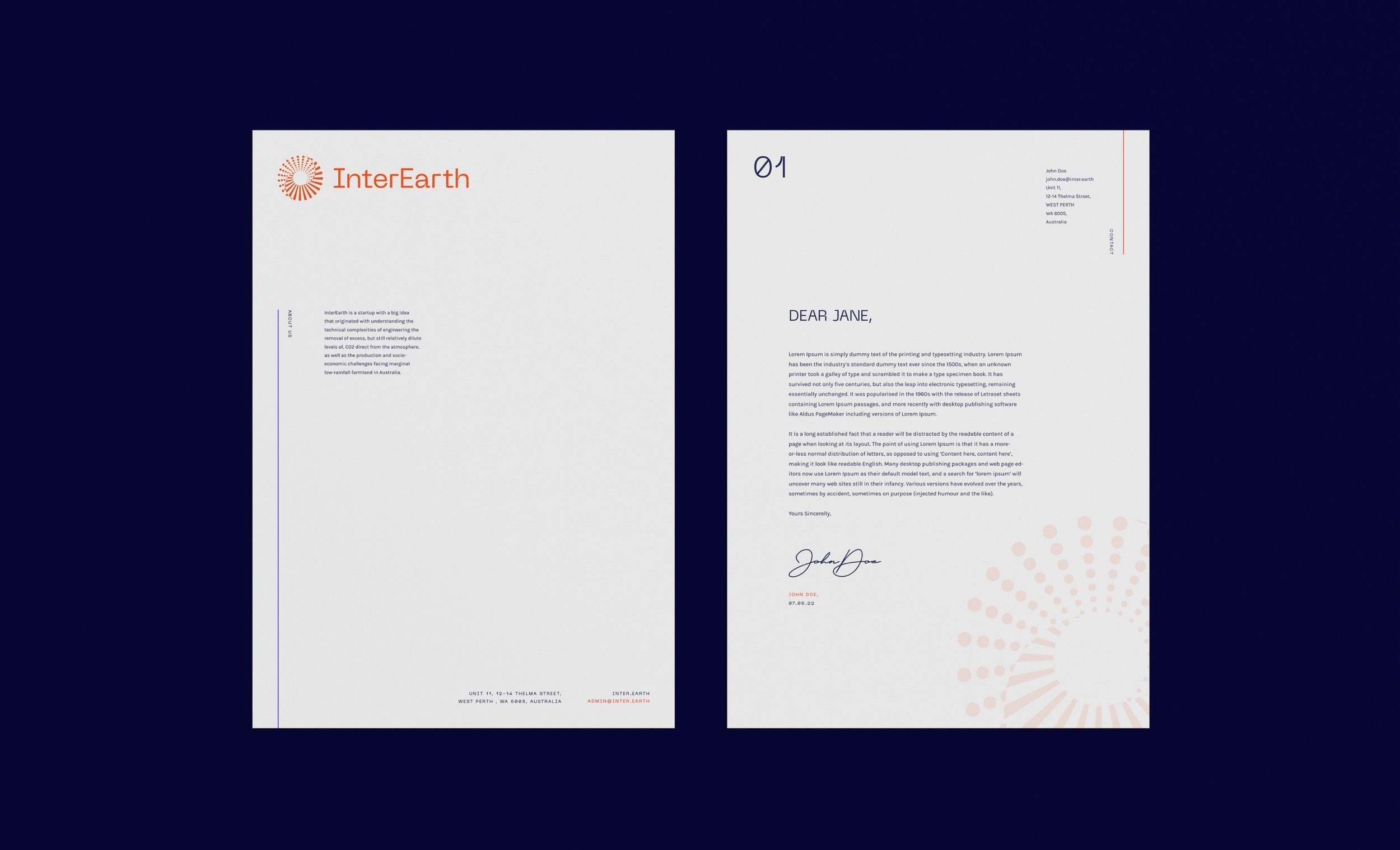
A unique visual approach designed to stand out in the sustainability space, the visual approach reflects the dramatic landscape of the Australian outback, as well as the unique process InterEarth undertakes. The symbol, a spiralling combination of dots and lines to signify the downward momentum of a drill, the intersection of cut trees, the balance of Yin Yang symbol and the desert sun. Unifying the symbol and graphic expression is the influence of Indigenous Australian Art, a reflection of communities who spent years creating sustainable systems of living that worked in harmony with the natural landscape.