P R O J E C T
Heineken Champions Cup
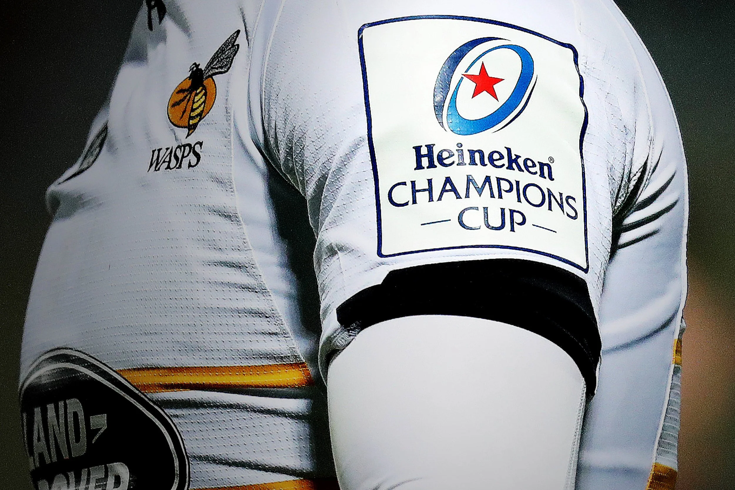
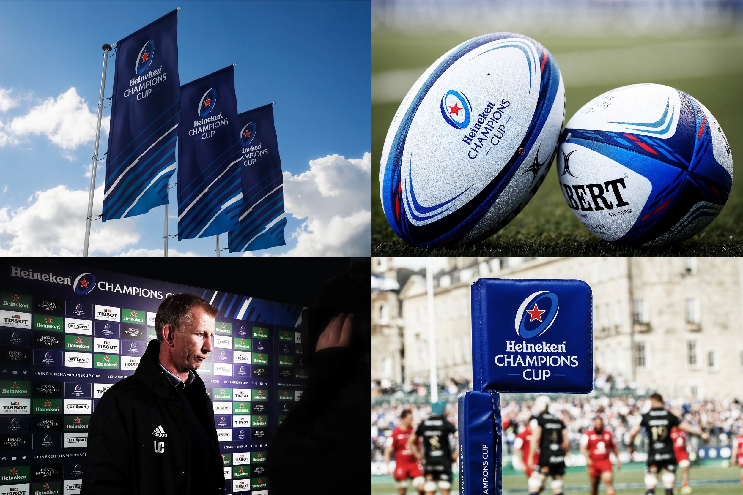
→ Brand identity
→ Broadcast toolkit
→ Stadium graphics
→ Created at Designwerk
T H E C H A L L E N G E
After incorporating a new title partner, Heineken, Europe’s premiere club rugby competition needed a strategic rebrand.
S O L U T I O N
The aim was to retain the equity of the old whilst creating a more simplified, robust and digitally friendly brand. The redesigned visual language is dynamic and bold, positioning the club competition right where it should be – at the very centre of club rugby.
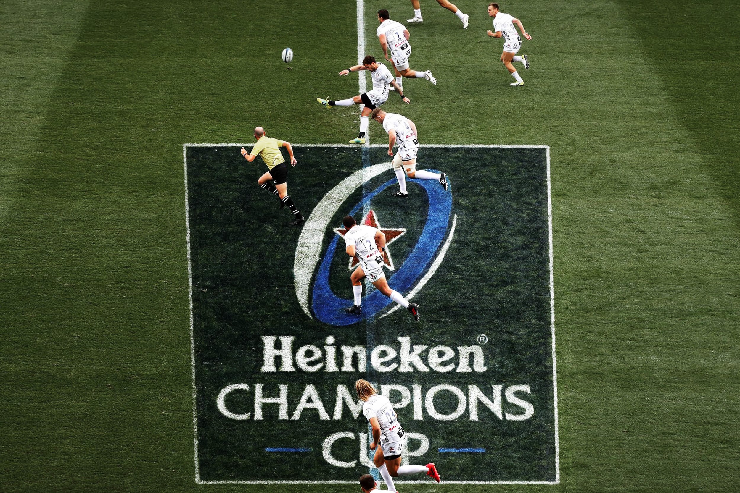

G R A P H I C L A N G U A G E
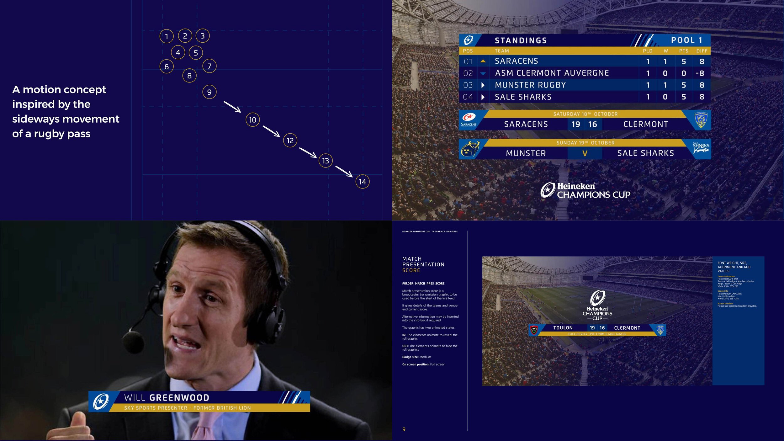
The supporting graphic language is inspired from rugbys lateral passing of the ball. The cuts and ridges that move through the pattern at different angles create a negative space that give the star movement, visualise the power and speed intrinsic to rugby

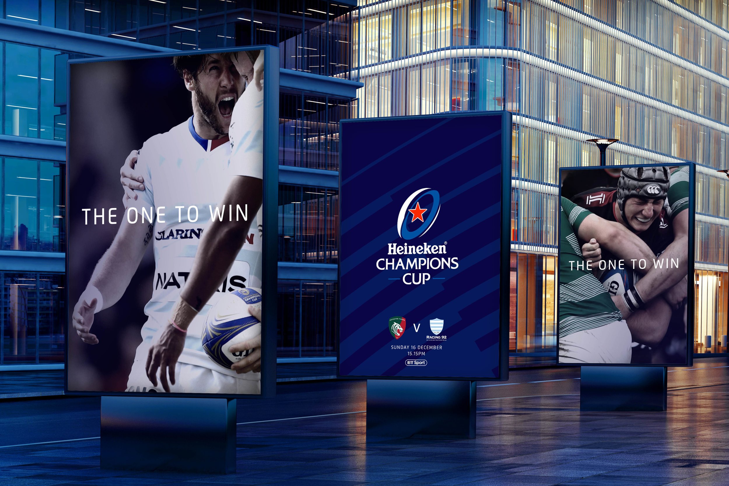

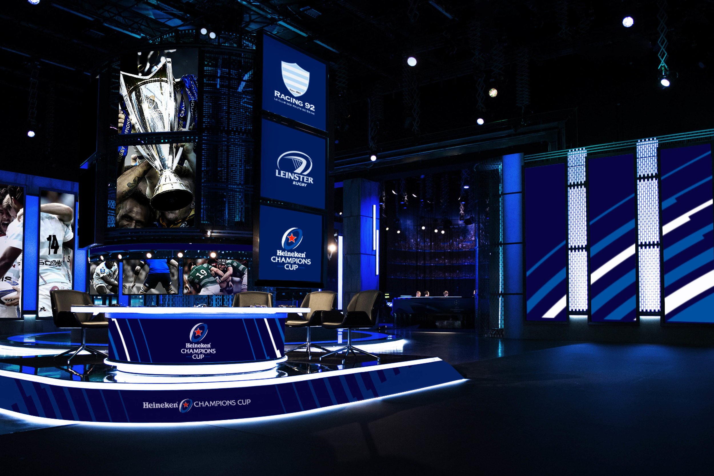
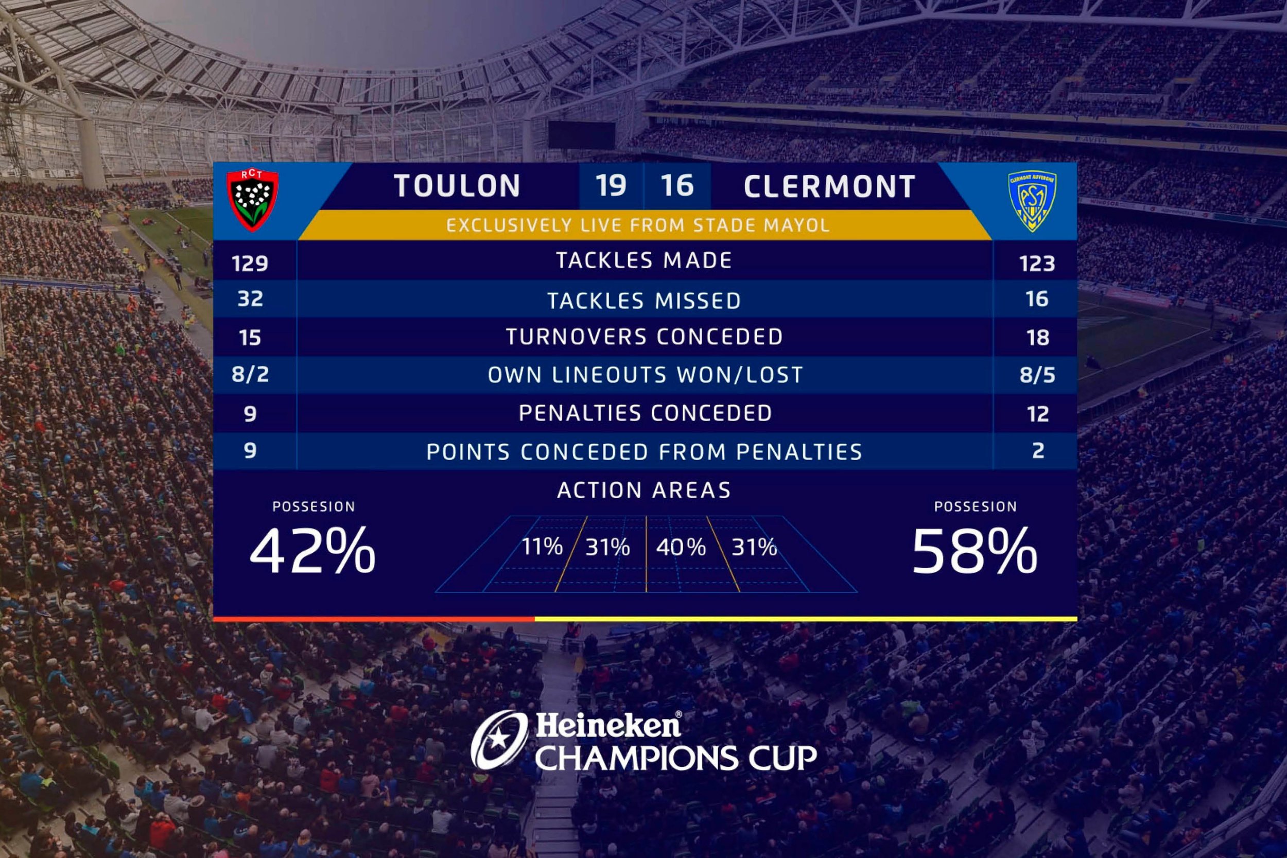
B R O A D C A S T T O O L K I T
The new, digitally friendly broadcast toolkit was used by Channel 4 and BT Sport, with a motion concept inspired by the sideways pass of a rugby ball

R E S U L T
Following the rebrand, the Heineken Champions Cup 2019 Final was the fastest selling in the competitions history